
10 tips for effective Visual Merchandising
- Yohany Albornoz

- Feb 20, 2025
- 5 min read
Updated: Sep 1, 2025
Effective visual merchandising is the key to attracting customers, increasing engagement, and driving sales—whether in retail stores, mall kiosks, or RMU setups. In my previous article, I explained how store design and consumer psychology shape purchasing behavior. This time, I want to go deeper and share 10 actionable techniques that will help you create clear, engaging, and high-converting retail displays.
With over 10 years of experience helping businesses in Miami, across Florida, and nationwide, I’ve seen firsthand how a well-planned store layout, lighting strategy, and product presentation can increase perceived value and customer interest. Some of these tips are based on traditional best practices, while others incorporate consumer psychology and neuromarketing insights, shaping what I like to call NeuroVisual Merchandising (maybe 🤷♀️) —the future of retail display strategy.
1. IDENTITY
Your physical environment must be a quiet representative of your brand, communicating clearly to the customer regarding who you are. To ensure you remain easily identifiable now and in the future, adopting solid and professional signage that includes your brand name, corporate colors, and graphics is crucial. Not only does this build trust, but it seamlessly guides the customer from the physical environment to your virtual environment.
A perfect example of this is the kiosk we designed for "Printing YourStory." As you can tell from the picture, their identity immediately comes into focus and stays with you. The thematic repetition of the brand name on the main graphic, their reiterative utilization of their trademark colors, and their placement of their service in the foreground leave no doubt. Walk-by customers don't just see a printer; they see a friendly, family-oriented brand. This strong, cohesive identity is the first critical step in capturing attention, building confidence, and ultimately converting passersby into engaged customers right at the point of sale.

2. COLORS
Color must be serving your brand identity and overall concept, conveying your message and circling your product. But it's not just what colors you use—it's how you arrange them.
Positioning products in a chromatic sequence (like in a gradient or rainbow gradient) creates visual harmony and calm, making displays more appealing and easy to shop. A 2011 study, "Rainbows, Halos, Glows, and Gradients," confirmed that shoppers favor—and shop more effortlessly from—color-grouped displays than by size or other characteristics.
The method gratifies the eye, facilitates decision-making, and makes conscious color alignment a powerful merchandising tool.

3. FOCAL POINT
The focal point is that part of the display expressly designed to immediately grab the customer's attention. Placed where customers naturally look at eye level, it effortless makes visual contact and generates instant interest. An effective focal point is fully incorporated into the overall idea being presented and is an intriguing enticement for customers to examine the rest of the product.
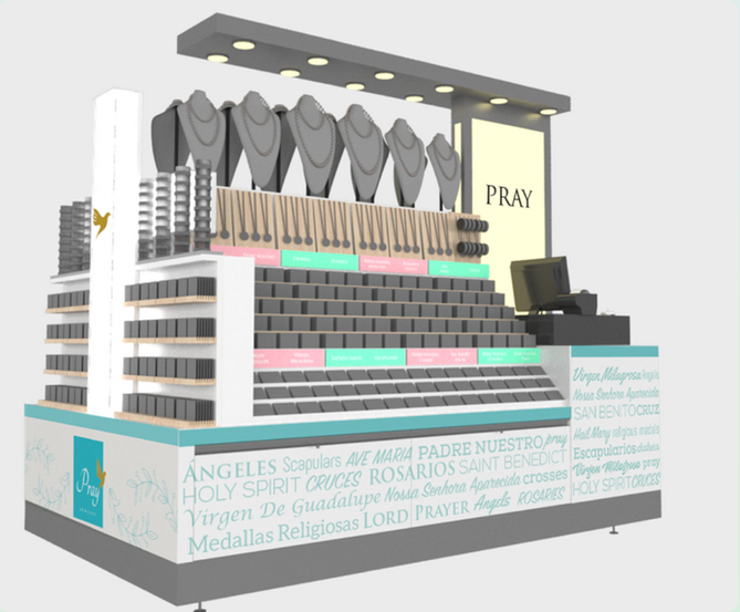
In the project we did with PRAY jewelry brand, the focal sign, with the large bold contrasting letters reading the word "PRAY," is a strong anchor. One can see it easily and conveys the major theme of the religious products below. The focal point is perfectly aligned with the products—e.g., scapulars, rosaries, and medals—offering a smooth story that engages the viewer. From this strong centre, the customer's eye is automatically led to filter through the adjacent products, effectively bringing order to the display and stimulating further.


4. LEVELS
When everything is flat it does not grab your attention, we need visual disruption to notice the product, structured disparities in heights that will allow us to understand each product, this is important because it is very hard to sell a person something if they do not understand what it is and how it functions, when that happens they are going to just go to the next thing that they see.
That being the case, levels can assist us in developing visual interest and designate places for certain products so they can be readily seen and comprehended on their own.


It is also important to note the difference of eye level, hands level and knees level.
The most important things should be at the eye level, they will be noticed better. They should be placed vertically towards the consumer so they can be seen, hung or on shelves.
Complementary items can be placed at hands level, at such a level products are less visible but available for the customer to grab and touch. Products should not be set on their flat side but angled so the customer can better understand them. It is very imperative to notice that unconsciously the lower a product, the lower their worth is perceived, so merchandise at such a level could be viewed as lower value for the customers.
Finally, anything placed at knees levels and below is out of the customer's view, and of course they are also perceived as less valuable products of the whole collection. The incline of the display is very significant to be able to understand the product, products placed vertically might turn out to be invisible.
5. CONSISTENCY, BALANCE, REPETITION
This allows the eye the chance to see more products at the same time, relate them together as a group and have a better understanding in a short amount of time, and also from the distance.


6. LIGHTING

Products should be easy to see, lighting helps to emphasize the product, and gives a clear and cleaner look.
Imagine that you have the same exact display, but one with light and one without. Which one do you, which one will look more appealing to you?.
7. THE POWER OF 3 AND PYRAMIDING
Neuromarketing tells us about the brain being impacted when it sees objects grouped in 3, it is also well known how creating a pyramid can act as a focal point itself where the eye goes to the top and moves along to explore everything around, which leads to an effective tactic to group merchandise this way.


8. DISPLAYS SHOULD BE DIFFERENT FOR MEN AND WOMEN
While men are attracted to unique and simple elements, they usually focus on one spot, women tend to have a panoramic view, and enjoy having many options. This knowledge helps us understand how we can better target our merchandising in a case that is aimed to a man or a woman.
9. TANGIBLE
The consumer likes to feel, touch the product, whatever is tangible. For this reason our visual merchandising strategy should be oriented to provide the customers the opportunity to feel the product, to provide a shopping experience that will connect with their limbic system.
10. BRAIN IS OPEN TO CREATIVITY
Brain is immediately attracted to anything it doesn’t know and tries to understand it. Presenting merchandise on a different and innovative way is a good strategy to grab customers attention. The example below is a package created by Kempertrautmann Agency in Germany, I love the very creative presentation of the package to promote the product.

Need expert guidance to optimize your store layout, mall kiosk, or RMU setup? At The Marketer Architect Agency, we specialize in retail design, visual merchandising, and consumer-focused strategies that increase engagement and sales.
📍 Based in Miami, Florida, we work with clients across the state and nationwide.
🔹 Let’s transform your retail space into a high-performing sales environment! Contact us today to discuss how we can help.
📩 Get in touch here: Contact Link


Comments